298 private links
a curated list of high-quality design resources including icons, illustrations, UI/UX kits, graphics, templates and more


One-stop resource for everything related to user experience
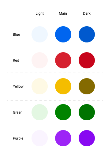
The yellow use at the end the three light, main and dark versions: https://miro.medium.com/max/732/1*Z3-7A-fzDVuqEt-tF8fFIQ.png
The dark one looks brown but the important part is to mix them.
Scroll horizontally to observe wealth based on pixels
Une carte de la Terre du Milieu adapté à la France
Feature available or not in your current browser
Une des premières leçons du manager sur une équipe : Lâcher prise. Laisser l’équipe faire ses choix et défendre moins fortement les siens, quitte à laisser l’équipe se planter.
L’idée c’est de ne pas être le directeur, juste le manager. C’est à l’équipe de décider, pour favoriser son implication, son initiative, sa responsabilisation, sauf à vouloir une équipe d’exécutant.
Web Content Accessibility Guidelines Success Criterion 2.4.4: Link Purpose (In Context) instructs us to ensure that a link’s accessible name makes sense when separated from its surrounding context. It’s why “learn more about elephants” is a far more effective link name than “click here.”
Cool to know.
This is all about maintaining an equivalent experience by not over-describing something for only a certain subset of people. Here, the goal is to preserve the author’s intentional act of creating a sense of curiosity, regardless of the way someone interacts with technology.
About schema; tables; collections; keys and columns; unique, primary and foreign keys
User-facing state is what someone experiences when they interact with (or try to interact with) an element in some capacity. It is reactive, helping to communicate the ways in which something can be manipulated.
It is also worth noting that on the web, the majority of user-facing state can be communicated programatically. This means that there is an HTML attribute or ARIA declaration that can ensure people who can’t see the content can understand the state something has been set to.
It is different from the application state.
The states:
- resting: the status of something before someone has interacted with it, or other content affects it. Oftentimes referred to as “Base” or “Default.”
- hovered
- active
- focused
- visited
- loading / loaded
- disabled
- hidden
- readonly
- enabled
- checked: marked for sending as data to another internal or external resource. Can be focused, but keeps it's selected state after focus is moved
- unchecked
- undeterminate
- selected / deselected
- dragged / dropped
- collapsed / expanded
- resizing
- dirty: an editable element that has been manipulated on one or more occurences
- pristine: editable element has yet to be manipulated by someone
- saving
- overflowing
- scrolling
- playing / paused / stopped
- sticky
- unstuck: sticky element removed from a side of the viewport back it its original position
A lot of wallpapers are available under this category. Thanks smashing magazine and Cosima Mielke :)
Les katas "sont pensés pour permettre d’introduire une idée ou une pratique bien précise, mais je ne pense pas qu’ils permettent de progresser très loin"
Et les problèmes spécifiques aux entretiens d'embauches: "sont un autre cas : certains couvrent des sujets fondamentaux d’algorithmique (écrire un arbre binaire…), d’autres sont plutôt des puzzles où la connaissance nécessaire pour les résoudre n’est utile qu’à la résolution de ce type de problème."
La répétition est aussi peu utile.
Une manière de s’entraîner, mais j’ai l’impression souvent peu structurée, est de faire des mini-projets, par exemple en réimplémentant des versions simplifiées outils qu’on a l’habitude d’utiliser.
Cependant, l'apprentissage n'est pas le même pendant ce mini-projet.
Ma suggestion, pour les personnes qui développent des mini-projets et qui veulent en parler, serait donc de documenter ces éléments (durée du projet, domaines couverts, moments où on apprend le plus de choses) pour que d’autres puissent en profiter.
Best toggles:
- Inactive button coincides with the background / Active button has a highlighting background. "we suggest you use a combination of saturated lively color (ideally corresponding with your CTA color scheme) and a light grayscale neutral color. "
- Active button has a check sign
- Active button has bold text (a bigger font size helps too)
About the 5-second and 20-second tests:
The results confirmed our expectations since the average error rate was lower in the 20-second tests and the Success-Confidence score was higher. However, these differences were not significant.
There is a difference of 0.5% in the error rate and 2.5% in the confidence score.
The ticks could be perceived as outdated (akin to a physical form more than a website). As for radio button icons, you might as well use a radio button instead.
Oui mais, cela dépend énormément de ton environnement. Voici pourquoi.
C'est aussi vrai, que sans rien, sans travail, sans efforts, on ne peut pas arriver non plus à un bon poste.
Si les feedbacks sont là, la revue annuelle n’en est que la synthèse, et un moment privilégié pour discuter de l’avenir.
Dire le positif semble beaucoup plus courant dans d’autres cultures mais est vu comme pénible, difficile, inutile et très artificiel dans la culture française. Et pourtant… je suis convaincu comme l’auteure que c’est essentiel au bon fonctionnement de la relation.
KeeOtp2 is a plugin for KeePass. It provides a form to display one time passwords. The TOTP secret keys are stored in a normalized format, so this plugin is fully compatible with the built-in OTP function. It also can be used as a GUI for the built-in OTP function.
Find unused dependencies: npx depcheck
Or install the package and run the command.
There is also npm-check that checks for outdated, incorrect, and unused dependencies.
Also available as font, svg or react component.
Sizes are 16, 24 and 32 px with a stroke of 1, 1.5 or 2.