303 private links
It has more impact than "semantic HTML" but it they share common goals.


It can be a meme: instead of talking about semantics, UX is trendy and can be used as trendy shit word instead.
UX HTML is more accessible, less error-prone, more maintainable because it uses the right tags and attributes. Yes it is semantic at the end.
So UX of HTML matters.
:has has a lot of possibilities with drag'n'drop. Here the developer uses 3 items: mushrooms, potions and .
For example: dragging some items to make parts of the site grow. https://lynnandtonic.com/assets/images/thoughts/case-study-2022-mushroom-header.mp4
See https://lynnandtonic.com/assets/images/thoughts/case-study-2022-david-rose.mp4 for more real interactions.
A potion adds color: https://lynnandtonic.com/assets/images/thoughts/case-study-2022-home-potions.mp4
with the UX tips https://www.uidesign.tips/ux-tips
Both Figma and Photoshop are for people who believe the web looks like an image.
Semantic HTML is a must. Because there is UX with HTML :D
Another thing our design tools really don’t give a shit about is accessibility. And to be honest, I think most of our industry doesn’t really care about accessibility as well.
Looks also valid to me.
The specialists who helped the architect in making sure it was certified did nothing else than ticking boxes. And this is exactly what most of us do when we think we make our sites accessible. We tick the WCAG boxes.
A website that embraces Brutalist Web Design is raw in its focus on content, and prioritization of the website visitor.
A website is about giving visitors content to enjoy and ways to interact with you.
Guidelines:
- Content is readable on all reasonable screens and devices.
- Only hyperlinks and buttons respond to clicks.
- Hyperlinks are underlined and buttons look like buttons.
- The back button works as expected.
- View content by scrolling.
- Decoration when needed and no unrelated content.
- Performance is a feature.
The only limitation of brutalist web design is that it is designed for content and not interactions. So this design method does not fit dashboards of real-time data for example. Am I missing something here?
I appreciate the guidelines that can be reused on every usable and accessible website or applications.
A quickstart tip:
Start with left-aligned black text on a white background, and to apply styling only to solve a specific problem
and more tips:
- Understand the semantic meaning of HTML elements.
- Learn about typography.
- Try designing for a small screen by default.
- Learn from designers about their choices and why they made them.
- When in doubt, do what Tron does: fight for the users.
A workflow or framework with methods for each step
It's a growing directory of tools, articles, books, podcasts, and other learning resources to guide us in creating more ethical and more inclusive products.
You build things thinking you know what people want and how they’ll use it but they’ll often surprise you.
I distinguish 2 cases:
- I build for me, so I don't care about feedback
- I build for others and the user feedback is gold
A list of patterns for better UX with AI. For example, the user has the choice to use a gender neutral AI, an explanation of the algorithms and opt-in or opt-out the use of AI.
It has 60 patterns at the moment.
Some cards are mixed to create a new type of user.
The only time people really change their behavior is when the new behavior is less work than the old behavior. The only time they like changing their behavior is when you show them a better and easier way to do things; when you make their life better. This is the only time 'user education' really works.
Another personal blog :)
This guide provides guideline for animations. Here are the following rules:
- 200-500ms is the optimal speed for interface animation
- on mobile device, the duration of animation should be limited to 200-300ms.
- on tablets, it should be longer by 3ß% as the screen is bigger so objects overcome the longer path when they change position.
- on wearables, the duration should be accordingly 30% shorter
- the duration of web transitions should last about 2 times shorter than on mobile devices — between 150–200 ms
- the more bigger the element is, a bot better when it lasts a little longer.
- When objects collide, the energy of collision must be evenly distributed between them according to physical laws. Avoid the bounce effect.
- The movement of the objects should be clear and sharp. Avoid motion blur.
- List items (news cards, article list items) should have a very short delay between its appearance: 20-25 ms.
Easing makes the movement more natural: the object should move with some acceleration or deceleration — just like all live objects in the physical world. There are 3 categories:
- linear motion: it looks very unnatural and artificial to the human eye.
- ease-in (acceleration curve): should be used when the objects fly out of the screen at full speed and won't be displayed again.
- ease-out (deceleration curve): should be used when the element emerges on the screen. his can also be applied to different cards or objects that appear from the outside of the screen.
- ease-in-out (standard curve): is the most frequently used in interface animation. In doubt, use this animation. Ease-in-out is used when the objects move from one part of the screen to another. The same movement type should be used when the element disappears from the screen but the user can return it to the previous place at any time.
Equal interaction: the appearance of all objects obeys to one particular rule
- A vertical list should be guided in one fluid direction
- Grid should have a diagonal appearance
- subordinate interactions (one central object which attracts all user's attention): animate as minimum objects as possible at one time.
- when the moving objects transform their size disproportionally, they should move along the arc rather than in a straight line.
- if the paths of the moving objects intersect one another, they cannot move through each other. In another case, the moving object can rise above other objects.
- Due to color vision deficiencies, it’s a good idea to always complement error messages with an icon
- Additionally, it might be a good idea to guide users towards specific issues of the form with an error summary.
- Never cover user inputs
- First of all, we avoid tooltips that open on hover and display the tooltip only once tapped or clicked.
- Error message position:
- they should be placed above input for various reasons, but it costs layout shifts. In doubt, a collapsible accordion instead might be a better idea there.
- they should be placed inline in tables. One of the simpler patterns is to display the error message in the same row where the content lives.
- Avoid toast error messages
- Establish stop-words for your error messages: they should never be used. See Error messages
- Provide Examples Of Correct Input or guide the user to the expected input. For example, "IBAN starts with the country code. For example, DE or AT.
- Display Error Summary on the top
- Additionally, you might want to adjust the favicon and the title of the document if errors do appear,
Check the interaction is ok
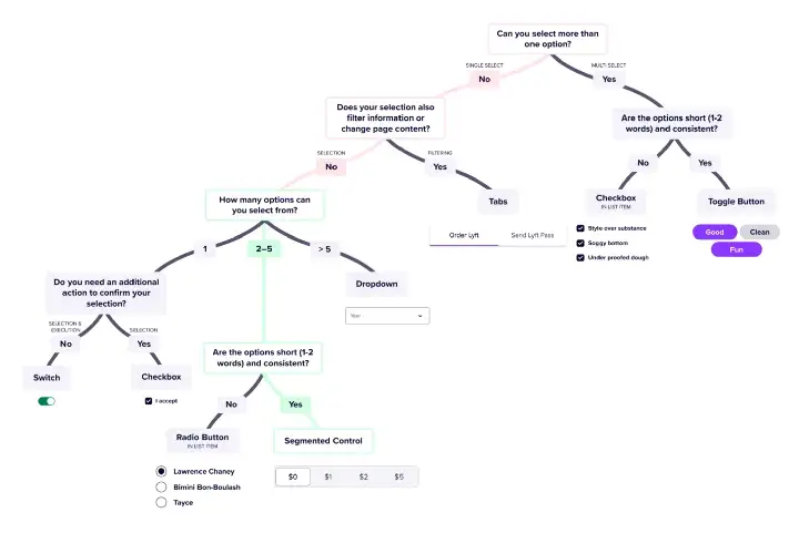
The Selection control ecosystem flow chart has a great tree-choice to display the expected field component.
Which errors or alert message should be used?