297 private links


So much !
The way it is written is smart 👍
.hover-1 {
  --h: 1.2em;

  line-height: var(--h);
  color: #0000;
  text-shadow:
    0 calc(-1*var(--_t, 0em)) #000,
    0 calc(var(--h) - var(--_t, 0em)) #1095c1;
  overflow: hidden;
  transition: .3s;
}
.hover-1:hover {
  --_t: var(--h);
}One thing that is frustrating about searching for Tailwind stuff on the web is that because it’s the Hot Framework Of The Moment™, there’s a lot of garbage articles out there, jumping on the hype train.
Malediction of success
On this website, you can adjust the amount of CSS that you want :)
| Characteristic measured | External linked .css file |
inline stylesheet with <style> |
|---|---|---|
| Mobile friendliness | 100/100 | 100/100 |
| Mobile speed | 89/100 | 98/100 |
| Desktop speed | 96/100 | 98/100 |
| PageSpeed Score | A, 96% | A, 97% |
| YSlow Score | A, 95% | A, 96% |
| Page Load Time | 0.7s | 0.5s |
| Total Page Size | 116kb | 116kb |
I’m saying: consider the options, weigh them up against the norm and test them out. As long as you have a good reason behind the implementation, it kind of doesn’t matter what others think.
Styles are based on the HTML tag. This library is small and can be reused very fast.
It seems better for small projects than TailwindCSS.
→ Remember: if your user is supposed to go somewhere, use an <a> element. If something with JavaScript needs to happen, use a <button> element.
I agree with that: link for navigation and button to trigger actions.
mask can hide part of the element is applied to.
It is a shorthand for all mask properties. I didn't find real example yet.
- trigonometric functions
- new viewport unites
- :focus-visible
- scroll-behavior can be smooth :)
- lazyloading images by default with an attribute
array.prototype.atsupports negative integers
Breakpoint:   0       200px     400px     600px     800px     1000px    1200px    1400px
               ├─────────┼─────────┼─────────┼─────────┼─────────┼─────────┼─────────┼─────────>
 Slice:        ·   xxs        xs   ·    s    ·    m    ·    l    ·    xl       xxl       xxxl
               ·                   ·         ·         ·         ·
               ·                   ·         ·  at(m)  ·         ·
               ·                   ·         ├────────┤·         ·
               ·                   ·         ·         ·         ·
               ·                   ·         · from(m) ·         ·
               ·                   ·         ├─────────────────────────────────────────────────>
               ·                   ·                   ·         ·
               ·                   ·            to(m)  ·         ·
               ├──────────────────────────────────────┤·         ·
                                   ·                             ·
                                   ·         between(s, l)       ·
                                   ├────────────────────────────┤·
Using slice instead of pixel values makes it more comfortable. I am still using the mobile-first approach.
Another one to test. It looks ok though
- flexbox
- CSS grid
- CSS Custom properties
- Preference Queries
- Color changes
- Variable fonts
- Paths
- CSS filters
- Houdini
- Shadow DOM
- Native CSS modules
And coming: container queries, container units, native nesting, scoping, cascade layers, :has() selector, @scroll-timeline
Syntax, timing function, looped animation, multi-step animation, alternating animations, shorthand values, fill modes (forwards and backwards), dynamic animations with CSS variables
How to fingerprint, with CSS and the according project: https://github.com/OliverBrotchie/CSS-Fingerprint
Skeuomorphism relies on real-world aesthetics to make the UI intuitive and familiar. The app logo of YouTube on iPhone was a TV for example.
Flat and Material design has dominated the web UI landscape since the early days of responsive design
The dream of a more tactile-looking 3D web UI lived on, and it resurfaced in 2020 as Neumorphism.
A mix of Skeumorphism and Material Design.
Neumorphism also has serious accessibility flaws. The poor contrast made the UI unusable for users with poor vision or color blindness, and it’s difficult to perceive visual hierarchy if the effect is overused. Moreover everything, including cards and other non-interactable elements, looks like a button.
Claymorphism builds on top of Neumorphism foundations. Although both use rounded corners, they differ in how they use backgrounds and shadow.
Pick your main color and this tool generate the platette that is WCAG compliant.
It generates individual Sass variables or css variables.
Summary:
RGB is known to be limited.
HSL provides a much more explicit way to describe the color:
- a position on a color wheel: hue (0-360, described as turn or degrees)
- how much of this color: saturation
- lightness
Looks better !
HWB: Hue, hiteness and Blackness. It is useful for creating monochrome color palette.
LAB is recommended if you want a color to look the same on-screen as, say, printed on a t-shirt.
It uses three axes: lightness, a-axis (green to red) and b-axis (blue to yellow)
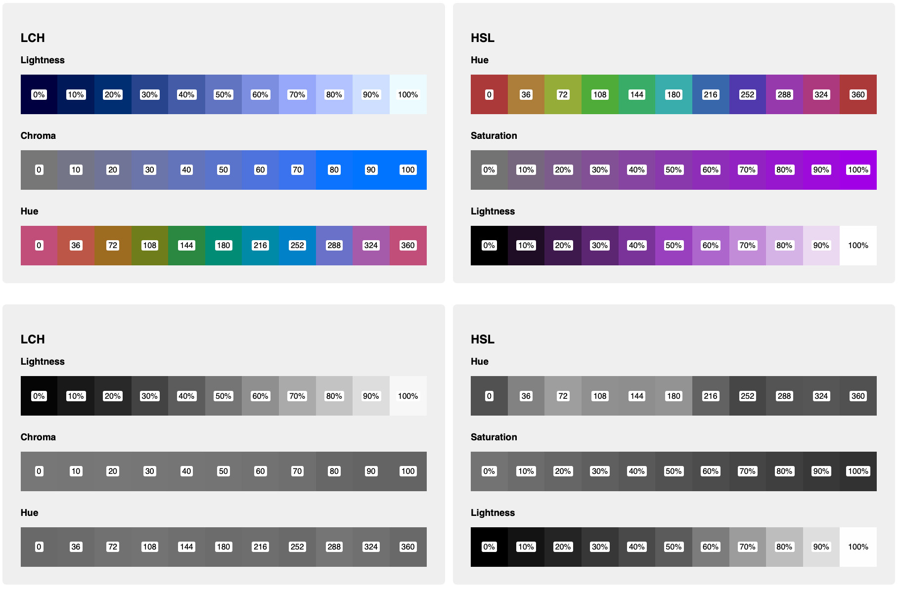
LCH is much more interesting for web development though. it stands for Lightness, Chroma and Hue.
- lightness: a pourcentage that can exceeds 100.
- hue : is working the same as in HSL
- Chroma : respresents the amount of color. It is similar to the saturation. In the browsers, there is often an upper bound.
More about it: https://lea.verou.me/2020/04/lch-colors-in-css-what-why-and-how/
A comparison between LCH and HSL : https://cloud.netlifyusercontent.com/assets/344dbf88-fdf9-42bb-adb4-46f01eedd629/4253d9b2-46d7-4b10-9e1a-b5f3ac6cea1c/5-modern-css-color.png
Tip: Holding down SHIFT and clicking the color swatch in the inspector in Chrome and Firefox dev tools will toggle the color value between hex, RGB and HSL!
Thanks for this cool tip !
Check the Level 5 Color specification for more about incoming color possibilities.
Only supported by chrome for now
- A Save-Data header is sent on each HTTP request. This allows dynamic backends to change the HTML returned.
- The NetworkInformation.saveData JavaScript API. This allows client-side JavaScript to check this and act accordingly.
- The upcoming prefers-reduced-data media query, which allows CSS to set different options depending on this setting. This is available behind a flag in Chrome, but not yet on by default while it finishes standardization.